SPAC Studio Art Senior Exhibit Review

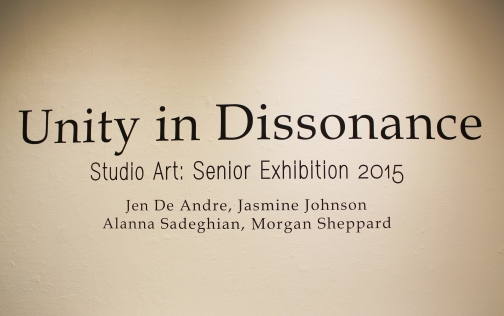
The studio art show in the Seattle Pacific Art Gallery is made up of four graduating senior artist’s individual work. The whole show is titled Unity in Dissonance, yet the title does not seem to capture each student’s works into one net. The show contains two print makers, one painter, and one photographer. After viewing the show, I am left with each artist’s potential, yet this particular series of his or her repertoire either lacks originality in concept or proficiency in skill. Each student has a promising future as they continue to develop in their artistic professions.

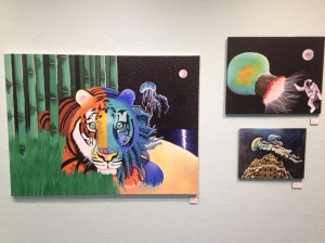
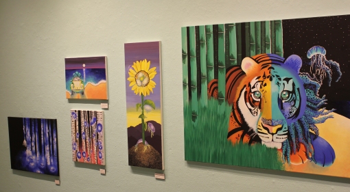
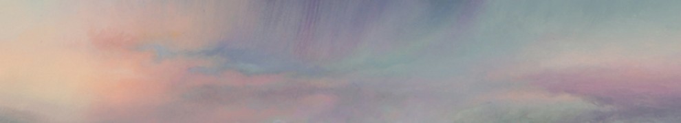
Walking into the gallery, the most striking image of the show is Jasmine Johnson’s central image, a painted jungle tiger mixed with a fanciful aquatic cat titled Hybrid. While the piece is the most noticeable, it is not the best of Johnson’s paintings, lacking depth and intricacy. Johnson exhibit as a whole circles around a fantastical reimaginings of jellyfish in unexpected places. In her collection, her more abstract pieces are stronger than the flashy realistic paintings containing the tiger, a car, or a flower. A piece titled Up, for example, demonstrates a more interesting painting style, which shows fluid jellyfish swimming above a rock that is stylistically reminiscence of Oceanic art and has a with a textured ocean in the background. I would have liked to see more paintings done in the style of this piece, that mix painting techniques with subtle elegance, and less of the pieces that seem to try to tell a narrative.

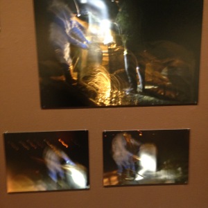
Moving clockwise around the room, Jenell DeAndre’s is next, with a series of photographs of her family’s oyster farming operation. They are all taken during the night, many blurred with lights streaming across the image. I find it interesting that none of the pictures are fully focused and it gives me a sense of curiosity. However, while I can appreciate what De Andre is trying to achieve in creating pictures capturing motion and activity, I can’t get past my first impression that they look like snap-and-shoot photography in low lighting. I am left wanting more. It would be interesting to redevelop this concept as a video experience or with sound along with the images.

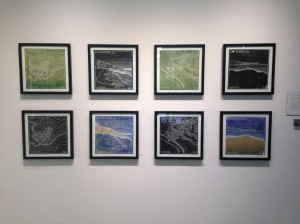
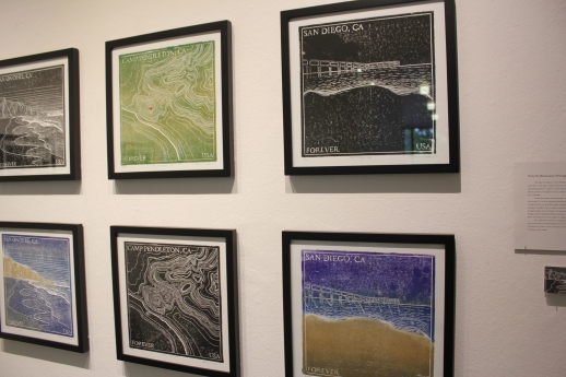
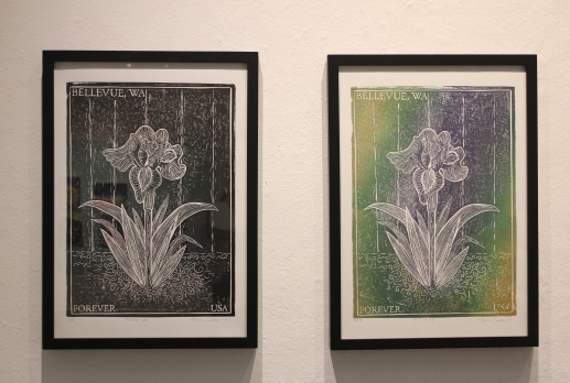
Allana Sadeghian’s exhibit is strongest and most professional of the show. She offers a series of ink prints that look like stamps for places in Washington State. There is one black and one color for each image. Sadeghian’s pieces are well produced. While the images are not completely original in style, it is interesting that she created them to look like postage stamps that further emote a sense of place.

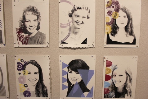
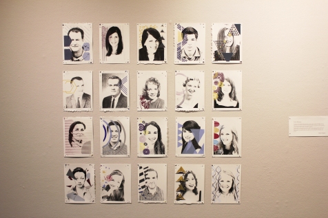
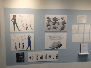
Morgan Sheppard’s, exhibit contains a series of ink printed pictures of people who are meaningful to her with designs overlaid representing each person. Sheppard’s concepts contain personality and spunk, yet the presentation leaves something to be desired. This would be an interesting concept to develop further, perhaps with more emphasis on the designed interpretation of each person and a more polished display of the pieces.

Amanda Erickson

Unity of Dissonance: Studio Art Senior Exhibition

The senior show for SPU’s Studio Art majors highlighted the projects of four students. When considering studio art, one thinks of the fine art hung in galleries and museums. And yet, that is not what these projects brought to mind. While trying to transcend sentimentality, every piece was personal and did not speak to the greater issues they were hoping to.

As I walked through, all the senior projects felt so personal, to the point that they were inaccessible. The most obvious example of this issue was Morgan Sheppard’s set of twenty prints. Each picture was a person that has meant a lot to the artist, and the designs on the photographs were supposed to express the person beneath the the surface, under the face. The colors were flat and dull, and the faces were printed in black and white. Like a yearbook, a catalogue of black and white photographs serve to remind the viewer of people they used to know, but the viewer doesn’t know these people. I found that the personal nature of this art only served for sentimentality, like a yearbook, not for interest or inspiration.

IMG_3815 (1)

This isn’t to say that infusing one’s work with what a person cares about, enjoys or is interested in, has an inherent negative impact on the piece, but there seems to be a line in fine art when art becomes too personal, so much so that the viewer can no longer relate. I would venture to say that the line exists between universal emotions or concepts and then specific personal experiences. In order to tap into an idea that is personal, but not too personal, an artist must step outside of themselves and ask if their art is broad enough to relate to their audience. Then be honest if it only serves himself or herself, and not their viewers.

Another issue I found with most of the student projects was the lack of originality and creativity. This is not to say that the pieces weren’t made well or achieved some level of aesthetic appeal, but there was nothing new and exciting that jumped out by the brilliance of its creativity. I found Alanna Sadeghian’s pieces, Unity in Dissonance: Postage Stamps, to be particularly usual. She had 6 pairs of printed, large stamps, each pair highlighting a different location with its image and title. Each pair was also the same image replicated, one in black in white, the other in colors. The simple and nice images were fitting to be postage stamps… not artwork hung in a gallery. The simplicity and color schemes were flat, which is part of the nature of the printing process, but in this project I found this quality boring. Though Sadeghian’s description added some understanding to the purpose the pieces, which was to highlight the human experience of places, the pieces did not live up to her hopes of the message they would convey. Instead, they only presented her sentimental love of stamps and lovely locations.

IMG_3816

The most abstract of this show was Night Tide, the photographs done by Jen DeAndre. Her work was unusual and had a lot of movement and contrast. In the description DeAndre made a beautiful argument about the role of the ocean in the world and the importance of its conservation and cleanliness. “Without the beautifully unique combination of the moon working with water, our planet would not be[…] life would not exist.” The problem was that reading her description was more moving and beautiful than looking at her work. The motion and light captured in her pieces felt accidental and haphazard rather than purposeful and artful. Unlike the other artists, she dared to be abstract and unusual. Unfortunately, DeAndre’s hopes of conveying her deep and personal thoughts about the ocean, did not come through in her photographs.

IMG_3818

The final artist of this show was Jasmine Johnson. Of all the artists, her work was the most colorful and eye-catching. The obscure and almost surreal nature of her pieces was fun to look and explore. Her project was named The Jellyfish Series, so as you can guess all of the pieces had images of painted jellyfish floating on the canvas. Each of Johnson’s nine pieces was unique and well-crafted with acrylic paint on canvas. I enjoyed these paintings more than any of the other projects, but I believe that it lacks a quality present in the fine art in museums and galleries. This quality I allude to is one that separates art for children viewers and for adult viewers. Johnson’s paintings are reminiscent of a child’s brand of paraphernalia, Lisa Frank. With very bright colors and playful themes, these paintings haven’t fully transitioned from their juvenile audience to adult audiences. I could see these pieces being hung in a coffee shop for casual viewers, but not in a gallery for serious art aficionados.

IMG_3814

Overall, I thought the prints by Sheppard and Sadeghian were flat and emotionless, the photographs by DeAndre were chaotic, and the paintings by Johnson were juvenile. I appreciated the effort and quality that the artists had in their pieces, but I was disappointed with what they offered in this show because I was not inspired and I could not easily move beyond their personal natures to appreciate their purpose.

– Hannah Bastedo

Unity in Dissonance

The theme Unity in Dissonance is an exceedingly beautiful idea. The thought that, despite drastic differences, there is a oneness that encompasses the world and knits every aspect of life together. It is the equalizer that keeps us bound to one another, to put this idea in a Pollyanna-esque perspective. Collectively standing in this Seattle Pacific University graphic design senior exhibition, I find very little unity and even less dissonance. One could argue that the entirety of this exhibition is in itself a symbol of unity and dissonance. All four artists, Alanna Sadeghian, Morgan Sheppard, Jasmine Johnson, and Jenell De Andre, created immensely different work from one another, but collectively stand together as bright-eyed young artists who, I would assume, want to make an impact in this world.

Perhaps the artist that has come the closest to touching upon this idea within their work is senior Morgan Sheppard in her collection of portraiture. Her series depicts the network of humanity and explains that we are all finely and intricately laced with one another. Though the idea behind this work is very well thought out and does not seem to err on the side of kitsch or cliché – I find that with the majority of her subjects being ethnically white, the potentially powerful message that Sheppard was trying to communicate was significantly lessened. The series photographs taken by the artist are very reminiscent of Warhol’s Screen Tests, with the black and white washed out qualities that make each individual look similar to one another.

Alanna Sadeghian, in my opinion, provided to be one of the strongest candidates in this exhibition. The collection of stamps that she has created, via linoleum block print, communicates a sentimentality that lends itself in a surprisingly positive manner that draws viewers into each design. I commend Sadeghian for effectively inviting viewers into her life to experience the places that have impacted her. Often, artists who attempt to create works as this unwittingly tend to be much more isolating than inviting. However, despite the laudations that I have been paying, even though the works by Sadeghian does edge toward the theme of Unity in Dissonance the personal superficiality of her work does not necessarily indulge this idea wholly. It seems as if she wanted to create something that everyone would “understand”, but by doing so risks becoming uninteresting.

I was more confused than intrigued by the works of Jasmin Johnson and Jenell De Andre. There is no doubt that both of these artists are talented and have exhibited that they are in the process of honing their skills, but one cannot help but think that these works were not created as a part of a group exhibition intended to share one meaning. Johnson, initially, drew me in with her brightly colored paintings depicting jellyfish. Though she uses each canvas well, often creating swirling constellations with her use of lines and space, I must admit I was drawn in more so because of my interest in sea creatures and not because of the works themselves. De Andre’s photography was the largest question mark in my head. At first glance one feels as if they are exploring extraterrestrial territory, launched into space and trying to make out what the unfocused beams of light are that are in front of you. De Andre describes her work as a depiction of her family’s oyster farm, however the subject is obliterated into nonexistence through her heavy abstractions.

These young artists have strived to create works that express harmony in spite of discord, their work is apparent that they have worked incredibly hard. Although this criteria was not necessarily met, the work expresses budding expertise in the field of art.

Landry Desmond

Unity in Dissonance: Studio Art Senior Exhibition 2015

SPU’s Studio Art exhibition features 4 seniors’ displays on work ranging from canvas painting to photographic prints. The theme of the show is “Unity in Dissonance,” however I don’t see dissonance in any of the artists’ work, but connections being made.

unnamed

Alanna Sadeghian’s inspiration is postage stamps – something she has always loved because of the places they can represent. She created a series of linoleum block prints of stamps featuring places that have impacted her life. There are two for each place; a black-and-white and a color version. Sadeghian’s work is the standout for me. Each piece is immaculately executed, the prints are well-framed, and considering the technique involved in carving the linoleum blocks the pieces are beautiful to look at, economical in line and color, and contain an interesting texture.

unnamed-1

Morgan Sheppard created 27 screen printed portraits of people who are important to her. For each piece, she layered the screen printed portrait, then the color, then patterns that depict the personality of the person portrayed. The portraits range from subjects of early-mid twentieth century photographs to current photos. While the colored patterns bring much needed interest to the portraits, the display comes off a little lackluster on the whole. The wall is painted grey behind the portraits, and I wish it were a different, more vibrant color because my eye easily slips right past. I also believe there is a touch of quantity over quality. There are only three layers to each piece and much white space. Had the number of prints been reduced and more elements been poured into those, I would be wholly more interested in Sheppard’s display.

IMG_3263

Jasmine Johnson created acrylic paintings in a series she entitles “The Jellyfish Series.” Each painting includes jellyfish “where they wouldn’t normally be found,” as quoted from her artist statement. These jellyfish are woven into trees, floating through space, etc. The series on the whole captures this transcendental quality – the surreality of dreams and the cerebral, mystical “floating” sensation Johnson means to portray with the jellyfish. While the sensations one gets from the series are very calming, color, for me, is what slightly misses the mark. Some pieces do exhibit colors I find pleasing to look at, especially in the context of Johnson’s intentions. Some I just don’t find pleasing to look at, and these are the more “color-wheel basic” colors. Two canvases feature a mix of oil paint and acrylic, which makes the texture of the paint standout from the other pieces. I find that a nice marriage of mediums, and wish the whole series had been this oil/acrylic mix.

unnamed-2

Last is Jenell DeAndre who created a photograph series where she paints with light, using long exposure to capture the ribbons of light in the night sky. I was intrigued by the photos, by themselves, until I read her artist statement. Light-painting is beautiful – whimsical on some occasions, sparky and energetic on others, and some of her pieces do achieve this. However, when one reads that the intention of her photos is to show the energy of working on an oyster farm on the water at night, the connection is lost. On sight, I didn’t pick up ocean, and unfortunately, some of the photos simply look like out-of focus shots. I like DeAndre’s inspiration: ocean waves at night and the tides, but I feel there was more potential for light painting artistry.

Being that the show’s theme is unity in dissonance, I had a hard time finding any dissonance – no conflict or discord. Sadeghian shows connections between personal locations and the place-oriented nature of stamps. Sheppard shows connections between people and the pattern of their personality. Johnson shows connections between the floating nature of both dreams and jellyfish. DeAndre attempts to show connections between the energy of light and the night tide. On the whole, each display showcases unique, individual pieces that would be perfectly strong on their own.

— Brie Martinez

Unity in Dissonance : Studio Art 2015

Unity in Dissonance, the oxymoron that is the Studio Art show for the 2015 students, shows us a small but varied show in the SPU Art Center. With only four Studio Artists this year, the showcase is smaller but still embodies a variety of work. There is a strong connection to each artist’s original style and we also see many techniques used to convey the story of the artist’s work.

IMG_3530 copy

One of the stronger artists was Alanna Sadeghian. She took the concept of place and wanted to create an artistic expression of a place captured like a postage stamp would. Another method of stamp is to create a personal stamp, which is what Alanna did. She made her own designs and using tools, cut away at linoleum to create a stamp of a postage stamp. Each design was hand carved, painted and hand pulled to create these truly beautiful and detailed works of art. Overall, a personal favorite of the show as Alanna made clear her talent while had a great story behind her intention of creating.

IMG_3528IMG_3529

Another artist in this showcase who has a very unique and refined style is Jasmine Johnson. Bright and beautiful colors capture the imagination of the viewer though Jasmine’s creative renderings of jellyfish. The use of contrast and form as well and precision in how Jasmine paints makes her work really stand out. Though the color can feel oversaturated or too bright at times, her decision to paint a more fantastical style with new creatures and combinations works well for her works. Overall, I really enjoy Jasmine’s creative jellyfish paintings, and her talent is very evident.

IMG_3520

Morgan Sheppard wanted for her piece to use the concept of a self-portrait and create a more illustrative approach. She took the head shot of twenty different people that are important in Morgan’s life and then created a bitmap of each so that she could screen print each one onto a canvas. On top of each image, Morgan created her own artwork that she felt represented the individual and then applied this image on top of the portrait. Overall, her work shows great detail and visual interest due to her choice of color and form. This work feels more personal so as an outside audience it is more difficult to interpret and appreciate. Aside from this, the evident craft and concept behind the work is clear.

IMG_3525 copyIMG_3524

The last and final artist is Jenell DeAndre. Jenell’s work is all photographic. She plays mostly with light and a long exposure to capture a nighttime scene at her families’ oyster farm. Her concept is to capture the feeling of working the nighttime shift. “These photographs are a tangible portrayal of how it feels to work on a night tide.”
Though the darkness shows the nighttime, I would disagree and say that this is not initially a “tangible portrayal” Though there is a dark and mysterious scene being portrayed, it is impossible to grasp from just viewing the images that this is a nighttime scene on the oyster farm. The word tangible does not fit with this more abstract and interpretive collection, as the initial view of the show is not a clear representation, but a more reflective one. Overall, Jenell’s work lacks the sense of depth and story that other artist’s present, however it still evokes that emotional interest that is necessary in any good showcase.

IMG_3517

– Heather Dunmoyer

Illustration Senior Show: Diegesis

The name of this show is “Diegesis: (noun) the time and place in which a story takes place.” This should give the viewers some context for how to view the senior projects. The title was appropriate for illustration in general, but not all the projects lived up to this description.

This show gave the viewer an interesting look at the current state of illustration. Almost every artist’s style was distinct from its peers; from cartoonish to digital, to graphic novel, the diversity was evident. To unite all of these pieces in one show was a bit of a stretch. Although they are all forms of illustration, the genres and the contexts for the illustrations varied greatly. Understandably, it was unreasonable to expect perfect cohesion for a show that displays seven different artists, each with their own style and illustration interests. Yet, the title tried to tie them all together by alluding to the stories that the viewer should witness in each artist’s project. I just failed to see clear continuity when each artist has a different story to tell to different audiences. This dissonance distracted from appreciation of what each artist had to offer.

Historically, illustration was a way to help illiterate populations understand the stories or themes of a written work. Today, most children’s literature, including chapter headings in teen novels have illustrations. The comic book or graphic novel have also found a foothold in our culture. The purpose of illustration now is to enhance the story-telling experience, for a very visual culture.

All of the pieces in this show reinforced the new purpose for illustration, and in this way, all the artists were successful, because they displayed their incredible abilities to create an aesthetic element to a story. It was obvious that all the artists involved in this show were talented and creative. Yet, a few of the artist stood out in particular, for their creative style, continuity and economy. Micah Ables, Elizabeth Simpson and Emily Mogren stood out amongst their peers.

Ables found the perfect balance of detail and economy in his scenes from Dune. His context was straightforward, visually stunning and concise. By only providing five images, Ables gave the audience a taste for the story without spelling it out for them.

Simpson created well-developed characters, Soren and Fiore. The storyboard isn’t overcomplicated and her special and detail awareness was striking. Simpson set up the visual outline of her graphic novel, without overloading the viewer with details of its story and characters.

Mogren’s watercolor scenes were delicate, intricate and uncomplicated. The context and story line were easy to follow and beautiful to look at. She added an element of creativity in her contrast of the real sketchy world and the colorful enhancement of the imagined world.

What sets these three artists apart is what the other artists struggled to accomplish – an established story characterized by straightforwardness and beauty. These traits are weaker in their contemporaries’ works, in particular Ashley Meissner. With set of over 25 images, Meissner tried to convey a story with flashy pictures and song lyrics. Even with the description beside her display, it is a struggle to follow the plot and characters. The busy and flashy illustrations stand in stark contrast to the succinct elegance of Ables Dune illustrations or Mogren’s simple playful pictures.

I went to the show and I enjoyed seeing what the young illustrators of Seattle Pacific had to offer. Though I was not overly impressed, I can still acknowledge the talent I did see and appreciate, as well as the potential in the others, which I did not fully enjoy. All the artists had a story to tell, and all of them did it in their own way. They had a specific audience and seemed to cater to it fairly well. In order to stand out and shine, however, the illustrators had to show something more refined and organized. Their work needed a clear plot, aesthetic beauty and, in my opinion, it needed visual economy.

– Hannah Bastedo

Diegesis: the time and place in which a story takes place.

SPU’s Spring illustration show features a range of storytelling, from original conceptions to takes on pre-existing source material. Micah Ables’ illustrations based on the novel, Dune by Frank Herbert, are one of two presentations based off pre-existing material, but are no less creative for it. Two large-scale landscapes and one vertically-oriented piece efficiently convey the bleakness of the world the story is set in and the seemingly unending abyss conveyed through multi-dimensional sandy browns, oranges, and purples. Two character designs portray the uniqueness of the world’s human inhabitants. Ables’ display takes the cake as far as execution. The only aspect I find lacking is the limited quantity of illustrations, the limited views of this complicated world, though this opens Ables’ up to delve more fully in rendering the novel’s descriptions.

IMG_3095

The show includes a healthy diversity across all of its featured artists’ works. Brianne Hughes displays eight original character designs, the majority of which are ethnically diverse. Hughes’ project displays a geo-political map of her world, it’s rendering reminiscent of Skyrim and Lord of the Rings geographical maps. As far as technical skill goes, the map is the most impressive and accomplished aspect of her presentation. The character designs, and the scene from Hughes’ story show promising execution.

IMG_3096

Striking world building is evident across many of the artists, and is the standout feature of Elizabeth Simpson’s work. Simpson’s graphic novel conception features two main character designs rendered with a fluid dynamism in their actions, as well as a lineup of additional characters, but what catches the eye is the attention to detail on Simpson’s concept of an airship and various mechanical engineered designs fitting her world. Reminiscent of steampunk, the concept of the larger airship conveys a sense of the size and complexity of the ship. World building, achieved through a healthy range of illustrated settings, and technical skill, apparent in the multiple aircraft designs, pull Simpson’s work out amongst the more impressive.

IMG_3099

Many of the artists’ displays fall under the category of graphic novel or concept illustration, but Ashley Meisner adds the element of storyboarding and producing material for film. Meisner’s presentation is composed of a series of storyboards, movie poster, and screenplay about the tumultuous journey of a wolf-goddess. As Meisner intended the illustrations to act as concepts for an animated film, the renderings of the wolf characters – their expressions and centrality to the “film” – bring to mind other similar works, like the animated film Balto, though there is also resemblance to the graceful, calligraphical quality utilized in Okami. The latter reference is more intriguing, on a personal note, though it can be hard to spot in the many – bordering on overabundant – panels. However, with time I can see these storyboards elaborating on Meisner’s creation, smoothing out the kinks and adjusting for economy.

IMG_3093

Julie Carlson’s display brings the focus back to human subjects, and is a sort of liaison between the high fantasy of Ables, Hughes, Simpson, and Meisner and the more gentle fantasy of the two remaining artists. Carlson has produced many illustrations based off The Girl Who Fell Beneath Fairyland and Led the Revels There by Catherynne M. Valente. Carlson has depicted scenes from Valente’s fantastical world in creative compositions, with redesigns of each chapter’s title page featuring the corresponding illustration. As with Meisner, there are quite a few illustrations to Carlson’s display, though the extensive detailing of each one may be more of a hindrance. With an eye on economizing, the illustration can still convey what it needs to without appearing too busy to the eye.

IMG_3097

Transitioning into a decidedly more low-key fantasy, Emily Mogren’s display features a series of traditional pieces, rendered in graphite and watercolor. These individual illustrations read like pages of a children’s book ­– intentional on Mogren’s part – and tell the story of a little boy and his grandmother exploring their own innocent fantasies through watercolor painting, inspired by Mogren’s relationship with her grandmother. Mogren exhibits notable skill in her graphite illustrations and a proficient handle on the watercolor, creating expressive, simplistic pieces.

IMG_3100

The final artist of the show also displays work in watercolor. Like Mogren, Bethany Peter brings a highly personal inspiration to her numerous pieces. Peter’s work is also reads very appropriately as a children’s book, featuring instantly likeable animal characters and the potential for an endless possibility of adventures. The concept was inspired by the original stories Peter’s father told as bed-time stories, and Peter has expanded on them, providing a plethora of character designs and expressions in a charmingly simplistic world. A highlight of Peter’s work is the attention to animal anatomy and the crossover into rendering these anatomies for cartoonish or animated illustration.

IMG_3094

What stands out about this show is its cohesiveness in regards to the themes of sci-fi and fantasy. The artists display an intriguing range of fantastical worlds and sci-fi mechanics, from softly rendered to boldly expressed. Across all the artists, it is interesting to look at as a whole, offering big-picture conceptualizations (Ables, Hughes, Simpson, and Meisner) to focused ideas (Carlson, Mogren, and Peter) and would be of interest to the concept artist, character designer, and any lover of storytelling.

– Brie Martinez

Diegesis: A SPU Illustration Show

Articulating judgment onto a show of student work is an exceedingly difficult task. Their skills are apparent and visibly displayed – as this group of artists have spent their years being taught technicalities and the in’s and out’s of creating work. Aside from this fact, creativity within this bunch is still budding and it is safe to say that these gifted individuals display that innovation is not quite yet grasped. The show ‘diegesis: noun: the time and place in which a story takes place features seven senior art students: Micah Ables, Julie Carlson, Brianne Hughes, Ashley Meissner, Emily Mogren, Bethenny Peter, and Elizabeth Simpson. All seven of these bright-eyed artists have created displays of two-dimensional storyboards depicting various worlds of whimsy. Collectively standing, each piece is placed in a world of it’s own, individually, each as fantastical as the next. The artists, although exhibiting clear stylistic differences, gravitate toward worlds full of emotional sentimentality – an idea not uncommon to the 20-something aspiring artist.

Dune 1

With these pretences aside, Ables’ efforts standout amongst the rest, exhibiting more originality than his peers. His inspirations are clear; I am sensing a nod to the 1979 dystopian film Mad Max, but his work still seems to be relevant today in the midst of the societal obsession with apocalyptic futures. I will comment that his work does not give a complete feel of the story that he has begun to outline, which is understandable because his reference, the novel Dune by Frank Herbert, is a multi faceted commentary on politics, ecology, technology, and human emotion. However, because of his boiled down interpretation of setting and characters there seems to be a disconnect between the piece and its’ viewers.

Micha 2

Digressing from the shortcomings of Ables’ work, I do commend him on the character illustrations that he has created – seeing as they are wholly unique and strike viewers with a sense that there is a deeper story to be told by each of them separately – one is left with a desire to learn more rather than dismissing them as merely illustration.

sadsa

Simpson, like Ables, pulls from a variety of external sources in her storyboard creation. The characters, although interesting, seem to have stepped out of the world of Atlantis and Treasure Planet, both Disney creations are even stories about finding one’s place in the world(s). Both are also stories of unlikely misfits joining together to obtain their goals, which is clearly outlined in Simpson’s artist statement. Aside from this oversight, the illustrations that she displays are visual appealing and draw the viewer to study each mechanical figure separately, for each are deeply intricate and highly detailed.

dqweqweq

An argument could be made that the artists mostly risk being too influenced by Disney, often making nods toward fairytale-esque ideas of freedom and opportunity, but I still find myself drawn toward the works of Bethany Peter. Despite my natural inclination to dismiss nostalgia, the more one observes the wide-eyed animals within Peter’s pieces the more likely one is to be transported to their days of finger paints and mid-afternoon naps. The flare Peter has for positivity and cheerful design is seemingly overwhelming and, at first glance, may be interpreted as satire on children’s cartoons to the hardened heart.

– Landry Desmond

Diegesis: A Story to be Told

IMG_2828 copy
Diegesis, as defined by Seattle Pacific’s 2015 illustrators, is the time and place in which a story takes place. These seven artists fit that noun in their own way. Each individual has a unique story to share and do so through their compositions.

Aesthetically when you first walk into the SPU Art Center you’re welcomed by cool and soothing colors that chromatically fit  with each artist’s showcase. This square of color creates a nice boundary for each Senior Illustrator’s work and is immediately intriguing in the traditionally stark, white, space.

When beginning to walk around and focus in on each individual artist, we slowly begin to find the thematic element of story in each artist’s work and composition. Though this show holds on to the similarity in the theme of story, the work has a wide range of what stories are told. For example there are adorable and animated woodland creatures by Bethany Peter which look like they could be distant animal relatives of perhaps Bambi and Thumper. This is contrasted with the dramatic and extensive work by Ashley Meisner who has forty digital illustrations, a completed movie poster and over one hundred pages of her drama-filled screenplay that showcases this fanatical world of animated wolves. It is quite astounding the amount of work completed by these budding artists, though one cannot help but notice the lack of originality despite the great quantity of work. Playful, fun, and intriguing, though lacking in creativity. This combination connects us to disney’s Balto and characters from the classic Bambi. They need the memorable originality that other artists presented in the show.

IMG_2836

Michal Ables displays his memorable compositions which go beyond our tangible world to demonstrate an imaginative world and beings. His claim for his story is the concept of a “story though pictures.” Though initially his story is not as clear as other artists, there is something truly beautiful about his digital illustrations. Perhaps it is because he takes familiar images such as the Grand Canyon and juxtaposes it with an unfamiliar creature. One thing is certain, compared to all of the work in this showcase, what is lacking in quantity for Able’s work, he makes up in great originality. Depth, form, color and composition all are wonderful aspects to Able’s work making him the standout for this show.

IMG_2832

Emily Morgan takes an approach to a more familiar story. Her composition is one that relates to the elder figure helping to educate the young. In her visual narrative, Morgan takes the story of a grandmother showing her grandson how to create his own imaginative story through watercolor. Emily uses the gray color as imagery between the flat and boring world, to the colorful and incredible world that you can imagine. The story is heart-felt, simple, yet very memorable. Overall, the work is nicely executed as well.

Some artists had stories that lacked a sufficient plot. Julie Carlson has incredible illustrations for her book she is compiling however it was more difficult to piece together what the pictures were in relationship to without the text. Similarly, Elizabeth Simpson created the premise for a graphic novel about two misfit characters. Her work shows a more conceptual process and the beginnings of creation, however it is difficult for the audience to understand the story that Simpson wished to tell with her compositions.

Artist Brianne Huges in her artist statement includes this quote;

“I think there are two types of writers, the architects and the gardeners. The architects plan everything ahead of time… The gardeners dig a hole, drop in a seed and water it. They kind of know what seed it is, they know if planted a fantasy seed or mystery seed … But as the plant comes up and they water it, they don’t know how many branches it’s going to have, they find out as it grows.” ― George R.R. Martin

IMG_2840 copy

Huges is both an author and illustrator and utilizes both to create her story. In her work she took the time to, with wonderful detail, illustrate each character for her book. Though there was less narrative, it was easy to get a sense for these characters and what their personalities might represent.

Overall, Diegesis exemplifies the meaning, though some stories had greater impact and were more memorable. Each artist had a story to tell and though some might be more distinct and clear, it was evident that each story was personal and had great meaning to each individual. Diegesis is a show I recommend you explore. Look beyond the images and realize the deeper story in which they all tell.

-Heather Dunmoyer

Innocence in Memories: Studio Art Senior Show- Heidi Humphrey and Esther Choe

These two senior artists are clearly passionate women who are creating to impact the world and satisfy their artistic drive. Heidi, an artist talented in all trades, focused on her photography for her show, photographing children in their deepest innocence. Esther’s guache paintings reminisced of her homes for her past to the present contrasting the hardness of the photographs to the softest of the paint. Together these women brought together a show of innocence and memories creating a place of comfort and home.

Heidi’s heart has always been loyal to showing the world and her love for people through photography. She focused on the innocence in the children by looking into their eyes, believing that the innocence can be somehow found there. Her photographs were centered on the walls around the size of 16”x24”, taking the attention of all viewers. The photographs were beautifully done, clearly Heidi has talent with the way cameras work. She is a clear artist with the camera and knows how to use them correctly. As much as I enjoyed the clear and colorful photographs, the way the children were captured did not show viewers the innocence of them through their eyes. The more I tried to see what Heidi wanted her viewers to see, I continued to only see flattened family photographs of children instead of a deeper understanding of the secrets children are holding from us. Even though Heidi’s vision did not come across to viewers, it is obvious that Heidi is talented with the camera, capturing others in a loving light.

Esther’s series of homes added color and playfulness to the hardness and reality of Heidi’s photographs. Esther was driven to create the series in homes due to her experience of living around the world as an army brat. From Korea, to California, to Washington, she reminisced of the memories made in these places using the one place that gave her comfort through the moves, her home. In every piece, the same house with slight changes was represented in a new setting. The main change that occurs is where exactly the house is, whether in between skyscrapers in Sol, Korea, in the Death Valley, or among the Puyallup fair. The colors are extremely playful and engagement sucking viewers into the pieces. As much as these are supposed to be representations of Esther’s memories, it seems more like a fantasy world and not a reality. The places are distorted and almost dreamlike in a flattened state. Esther could have put more depth visually into the piece, really throwing the viewers into her memories. The colors may not have been as realistic but Esther still created multiple worlds from her past. Esther opened up showing a playful world where she grew and began the artist who she is today.

Heidi and Esther’s art were both contrasting in medium but the overall curation of the exhibit was unbalanced and seemed less of a joint show. Heidi’s photographs dominated the gallery, while Esther’s pieces only covered one wall. There would have been a better balance if there were less photographs and Esther’s work more spread out instead of squished together in one space. As much as the curation was disproportionate, the women’s artwork shown through. Their passion and talent told stories of innocence and memories through guache paint and photographs of the present and past. Heidi and Esther, senior studio artists, showed their talents impacting the Seattle Pacific Art Center and their future careers as artists.

~Amanda Theel, Junior Art History Major